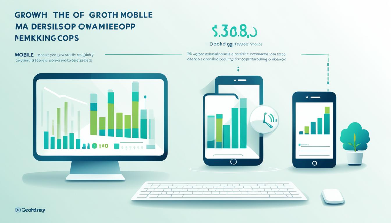
The mobile web has experienced extraordinary growth in recent years, surpassing its desktop counterpart as the leading platform for internet users. This shift is indicative of the evolving digital landscape and the changing preferences of users.
More and more people are accessing the internet through their mobile devices, thanks to increased internet accessibility and the convenience it offers. The rise of smartphones has played a significant role in driving this trend, empowering users to connect with the digital world anytime, anywhere.
In this article, we will explore the reasons behind the exponential growth of the mobile web and compare it to the desktop web. We will analyze user preferences and the browsing experience offered by each platform. Additionally, we will delve into the concept of a mobile-first approach in web design and discuss the implications for businesses and website owners.
Furthermore, we will explore the impact of mobile advertising on revenue growth and its role in digital marketing strategies. We will also provide insights into optimizing mobile web performance and discuss future trends in mobile web usage, considering emerging technologies and evolving user behavior.
Join us as we navigate the world of mobile web growth and discover how it is shaping the future of the digital landscape.
Rise of Mobile Web Usage
The rise of mobile web usage has revolutionized the digital landscape, transforming the way people access information and interact online. With the increasing availability of high-speed internet on smartphones, internet accessibility has reached unprecedented levels, allowing users to stay connected wherever they go.
One of the key drivers behind the surge in mobile web usage is the unparalleled convenience it offers. Smartphones have become an integral part of our daily lives, providing quick and easy access to the internet with just a few taps. Whether it’s checking social media, reading news articles, or shopping online, the mobile web provides a seamless and effortless browsing experience.
As a result, the mobile web has seen exponential growth, surpassing desktop web usage in recent years. According to a study by StatCounter, mobile web usage accounted for more than half of all internet traffic worldwide in 2020, marking a significant shift in user behavior and preferences.
“The proliferation of smartphones and the ease of accessing the internet on the go have propelled the mobile web to new heights. Users now have the power of the internet right at their fingertips, allowing them to stay connected and informed wherever they are.”
To highlight the impact of this shift, let’s take a closer look at the statistics:
| Year | Mobile Web Usage | Desktop Web Usage |
|---|---|---|
| 2015 | 45% | 55% |
| 2016 | 51% | 49% |
| 2017 | 57% | 43% |
| 2018 | 63% | 37% |
| 2019 | 69% | 31% |
| 2020 | 56% | 44% |
As shown in the table, mobile web usage has consistently grown over the years, with 2020 experiencing a slight decrease due to various factors such as the COVID-19 pandemic and increased work-from-home arrangements. Nonetheless, the dominance of mobile web usage remains undeniable.
The rise of mobile web usage has significant implications for businesses and website owners. It necessitates a mobile-first approach to web design and digital marketing strategies. By optimizing websites for mobile devices and prioritizing user-centric design, businesses can tap into the immense potential of the mobile web and effectively reach their target audience.
With the mobile web becoming the primary avenue for internet users, it’s crucial for businesses to adapt and stay ahead of the curve. By embracing the mobile-first mindset, companies can unlock new opportunities, enhance the user experience, and drive growth in the ever-evolving digital landscape.
Mobile Web vs. Desktop Web
When it comes to browsing the internet, users have a choice between the mobile web and the desktop web. Both platforms offer unique experiences and cater to different user preferences. In this section, we will compare the mobile web and the desktop web, exploring the key differences that have influenced the shift towards mobile web usage.
The Mobile Web
The mobile web refers to accessing websites and online content through mobile devices, such as smartphones and tablets. With the increasing popularity and widespread adoption of mobile devices, the mobile web has become the preferred choice for many users.
One of the main factors driving the preference for the mobile web is its convenience and accessibility. Mobile devices allow users to access the internet on-the-go, providing the flexibility to browse websites anytime and anywhere. Whether it’s checking emails, social media updates, or making online purchases, the mobile web offers a seamless and user-friendly experience.
In addition, the mobile web has evolved to incorporate features specifically designed for touch navigation. Touchscreens enable intuitive interactions, such as swiping, tapping, and pinch-to-zoom, enhancing the overall user experience. Mobile websites and applications have also embraced responsive design, ensuring optimal viewing and functionality across different screen sizes and orientations.
The Desktop Web
The desktop web, on the other hand, refers to accessing websites and online content through traditional desktop computers and laptops. While the rise of mobile devices has resulted in a decline in desktop web usage, it still remains relevant for certain activities and user preferences.
One of the advantages of the desktop web is the larger screen size it offers. This allows for more extensive content display and multitasking capabilities. Desktop computers often provide a more comprehensive browsing experience, especially when it comes to tasks that require multiple windows or complex interactions.
Despite the advantages of the desktop web, user preferences have shifted towards the mobile web due to its portability and convenience. The ease of accessing the internet through mobile devices has made it the preferred choice for many users, especially those who are constantly on the move.
Comparison: Mobile Web vs. Desktop Web
Let’s compare the mobile web and the desktop web across some key criteria:
| Criteria | Mobile Web | Desktop Web |
|---|---|---|
| Screen Size | Varies across different devices | Larger screens for more extensive content display |
| Navigation | Touch-based, intuitive interactions | Keyboard and mouse navigation |
| Responsive Design | Optimized for different screen sizes and orientations | May require manual adjustments for different screen resolutions |
| Portability | Allows access to the internet on-the-go | Tethered to a physical location |
| Convenience | Easy access anytime and anywhere | May require dedicated workspace |
Mobile First Approach in Web Design
In today’s mobile-centric world, adopting a mobile-first approach in web design is crucial. With the growing dominance of mobile web usage, it is essential for businesses and website owners to prioritize responsive and user-centric design strategies.
Responsive design ensures that websites adapt and provide an optimal browsing experience across various screen sizes and devices. By focusing on mobile-first design, businesses can cater to the needs and preferences of their mobile audience, delivering a seamless user experience.
The Importance of Mobile-First
A mobile-first approach in web design acknowledges the shift in user behavior, as more individuals access the internet through their smartphones and tablets. By designing with mobile devices in mind, businesses can create websites that prioritize essential content, streamline navigation, and optimize loading speed.
By designing for mobile first, businesses set the foundation for a user-friendly experience that carries over to the desktop, rather than trying to adapt a desktop design for mobile users.
Implementing a mobile-first approach also aligns with search engine optimization (SEO) best practices. Search engines, such as Google, prioritize mobile-friendly websites in their search results, recognizing the importance of providing a seamless mobile browsing experience to users.
The Benefits of User-Centric Design
Adopting a user-centric design strategy goes hand in hand with a mobile-first approach. When designing websites, it is crucial to understand the needs, preferences, and behaviors of mobile users to create designs that cater to their expectations.
“By putting the user at the center of the design process, businesses can create intuitive and engaging websites that resonate with their target audience.”
User-centric design focuses on creating interfaces that are intuitive, visually appealing, and easy to navigate. By prioritizing usability and accessibility, businesses can enhance user satisfaction and increase engagement on their websites.
The Implications for Businesses and Website Owners
Embracing a mobile-first approach and user-centric design has several implications for businesses and website owners. It allows them to:
- Reach a wider mobile audience
- Improve user experience and satisfaction
- Boost website visibility in search engine results
- Drive more conversions and achieve business goals
- Stay ahead of competitors
In a mobile-first era, businesses that prioritize mobile-friendly design are better positioned to succeed and meet the evolving needs of their audience.

By embracing a mobile-first approach and combining it with responsive and user-centric design principles, businesses can create websites that not only adapt to the preferences of their mobile audience but also provide an engaging and seamless user experience.
| Benefits of Mobile First Approach in Web Design |
|---|
| Improved website accessibility on mobile devices |
| Enhanced user experience and engagement |
| Higher search engine ranking and visibility |
| Increased conversions and business goals |
| Competitive advantage in the mobile landscape |
Mobile Advertising and Revenue Growth
In today’s digital landscape, mobile advertising has become a driving force behind revenue growth for businesses. With the increasing adoption of smartphones and the ever-expanding reach of mobile web usage, businesses are recognizing the importance of implementing effective mobile advertising strategies to tap into a wider audience and maximize their revenue potential.
One of the key reasons behind the shift towards mobile advertising is the exponential growth in mobile internet users. As more and more people access the internet through their mobile devices, businesses have realized the immense potential of reaching these users through targeted mobile advertising campaigns. By leveraging the power of mobile advertising, businesses not only increase their brand visibility but also enhance customer engagement and drive conversions.
In the realm of digital marketing, the rise of mobile-first campaigns has revolutionized advertising strategies. With mobile devices becoming the primary medium of online interaction, businesses are focusing on creating mobile-optimized content and ads to provide a seamless user experience. The era of responsive design and user-centric advertising has emerged, where mobile advertising is crafted to meet the unique needs and preferences of mobile users.
“Mobile advertising is no longer an option but a necessity for businesses looking to thrive in the digital era.”
When it comes to measuring the effectiveness of mobile advertising, businesses often rely on key metrics and indicators. These may include click-through rates (CTR), conversion rates, app installations, and return on ad spend (ROAS). By analyzing these metrics, businesses can gain valuable insights into the performance of their mobile advertising campaigns and make informed decisions to optimize their strategies for better results.
The Power of Mobile Video Advertising
One particularly effective form of mobile advertising is mobile video ads. With the increasing popularity of video content consumption on mobile devices, businesses have found success in engaging their target audience through captivating and interactive video ads. From pre-roll ads to in-stream ads, mobile video advertising presents a unique opportunity to convey brand messages effectively and leave a lasting impact on viewers.
Whether it’s brand awareness, lead generation, or driving sales, mobile advertising offers businesses a multi-faceted approach to revenue growth. By capitalizing on the immense reach and engagement potential of mobile devices, businesses can connect with their target audience in a more personalized and meaningful way, driving higher sales and maximizing their return on investment.
Mobile Advertising Metrics for Success
| Metric | Description |
|---|---|
| Click-through Rate (CTR) | The percentage of users who click on an ad after viewing it. Measures the ad’s effectiveness in generating interest and curiosity. |
| Conversion Rate | The percentage of users who take a desired action, such as making a purchase or filling out a form, after clicking on an ad. Measures the ad’s effectiveness in driving results. |
| App Installations | The number of users who download and install a mobile app after viewing an ad. Indicates the success of mobile app advertising campaigns. |
| Return on Ad Spend (ROAS) | An indicator of the revenue generated compared to the advertising spend. Measures the profitability of mobile advertising campaigns. |
As the digital landscape continues to evolve, mobile advertising remains a vital component of successful digital marketing strategies. By embracing the power of mobile advertising, businesses can unlock new revenue growth opportunities, connect with their target audience on a deeper level, and stay ahead in the competitive market.
Optimizing for Mobile Web Performance
When it comes to mobile web performance, page load speed plays a crucial role in ensuring optimal user experience. Slow-loading websites can frustrate users and lead to high bounce rates. Therefore, it is essential for website owners and developers to employ optimization techniques to enhance mobile web performance. These techniques not only improve page load speed but also contribute to higher search engine rankings and increased user engagement.
To achieve optimal mobile web performance, consider the following optimization techniques:
- Optimize images: Compress images to reduce their file size without compromising quality. Use appropriate image formats and dimensions for mobile devices to minimize loading time.
- Caching: Implement browser caching to store frequently accessed website elements, reducing the need to fetch them from the server each time a page is loaded.
- Minify code: Remove unnecessary characters, spaces, and line breaks from HTML, CSS, and JavaScript files to reduce their size.
- Enable compression: Enable GZIP compression on the server to reduce file sizes during data transmission, resulting in faster page load times.
- Use content delivery networks (CDNs): CDNs distribute website content across multiple servers worldwide, ensuring faster delivery to users by serving content from the nearest server.
Impact of Mobile Web Performance Optimization
By optimizing mobile web performance, website owners can significantly enhance user experience, improve page load speed, and increase overall site usability. This, in turn, leads to higher user engagement, lower bounce rates, and improved conversion rates.
Optimizing for mobile web performance is not just a technical consideration but also a crucial factor in digital marketing success. With search engines penalizing slower websites in mobile search rankings, businesses cannot afford to neglect mobile web optimization.
Implementing these optimization techniques ensures that your website is ready to meet the expectations of mobile users, providing them with a seamless browsing experience and encouraging repeat visits.
Future Trends and Insights
As mobile technology continues to advance at a rapid pace, the future trends in mobile web usage are poised to shape the digital landscape in unprecedented ways. With evolving user behavior and increasing reliance on smartphones and other mobile devices, businesses and website owners must stay ahead of the curve to remain competitive in this ever-changing environment.
One of the key future trends in mobile web usage is the integration of artificial intelligence (AI) and machine learning. AI-powered voice assistants and chatbots are becoming increasingly common, providing users with a more personalized and interactive experience. This shift towards AI-driven interactions opens up new possibilities for businesses to engage with their target audience and deliver tailored content and services.
Another important trend on the horizon is the seamless integration of augmented reality (AR) and virtual reality (VR) into the mobile web experience. With the advancement of AR and VR technologies, users will be able to interact with digital content in a more immersive and realistic manner. This opens up a realm of opportunities for businesses, ranging from virtual product demonstrations to virtual reality-based shopping experiences.
Furthermore, the evolving user behavior towards mobile-first and mobile-only usage is likely to continue. With the increasing ease of access and convenience offered by mobile devices, users are relying more on their smartphones for daily tasks, including browsing the web. This shift in user behavior emphasizes the importance of mobile optimization and responsive design, ensuring a seamless and engaging experience across all devices.