Welcome to our Mobile Web Best Practices Series! In this series, we will explore the essential techniques and strategies for creating an optimal mobile web experience. In this first article, we will focus on simplifying navigation to enhance user engagement and satisfaction.
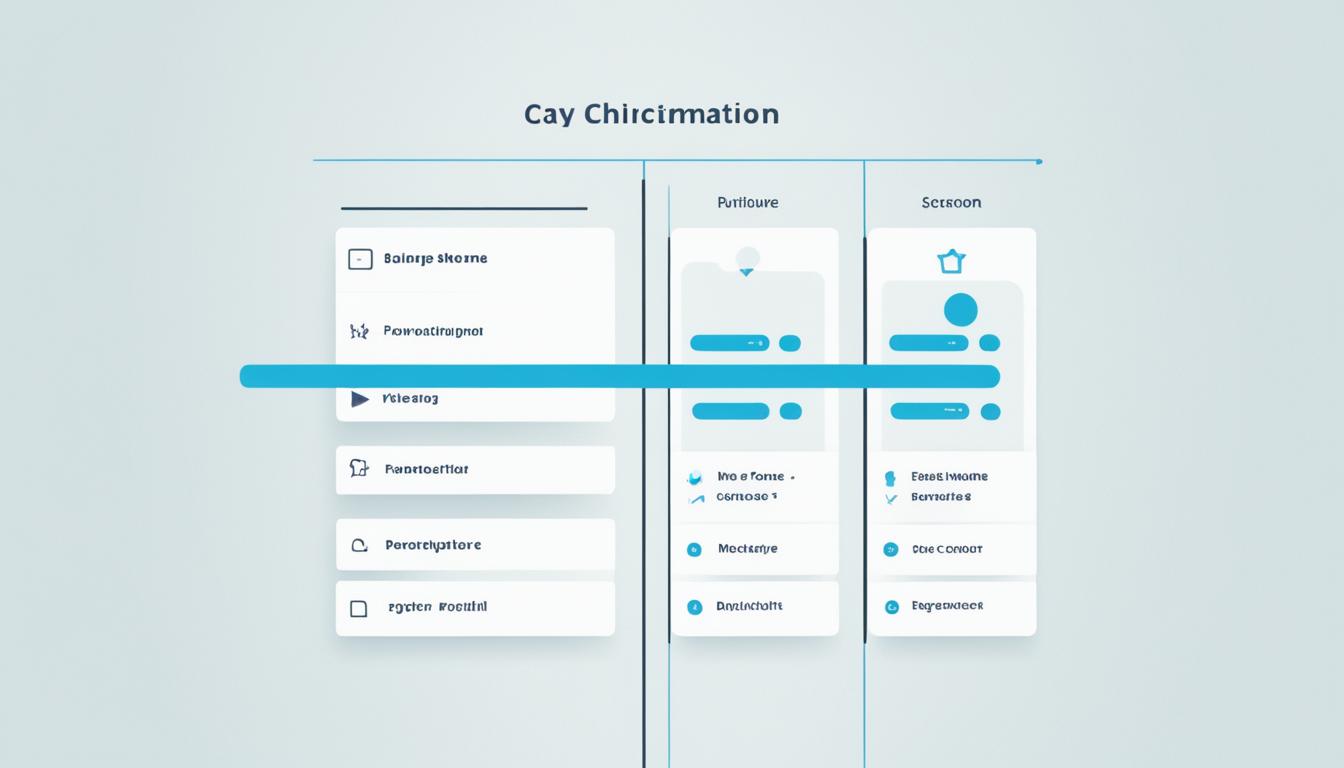
Mobile web navigation plays a crucial role in ensuring that users can easily find the information they need and navigate through your website effortlessly. With the growing number of mobile users, optimizing navigation for smaller screens is more important than ever.
In this section, we will delve into the best practices for simplifying mobile web navigation. By following these guidelines, you will be able to create a seamless browsing experience for your users, resulting in increased engagement and improved conversion rates.
To kickstart our discussion, let’s take a look at the importance of streamlining mobile web navigation and how it can greatly impact the overall user experience. A well-designed navigation structure can guide users smoothly through your website, reducing frustration and encouraging them to explore further.
But what are the essential tips and techniques for designing effective mobile web navigation? In the next section, we will provide you with actionable advice on responsive design, intuitive menu placement, and the use of clear labels and visible links to optimize navigation on smaller screens.
Lastly, we cannot overlook the importance of testing and optimizing mobile web navigation. In the final section, we will share proven techniques for A/B testing, gathering valuable user feedback, and analyzing data to make informed decisions about navigation improvements on your mobile web platform.
So, are you ready to dive into the world of mobile web navigation best practices? Let’s get started and unlock the potential of your mobile website for a seamless user experience!
Importance of Streamlining Mobile Web Navigation
The importance of mobile web navigation cannot be overstated in today’s digital landscape. With the growing number of users accessing websites on their mobile devices, it is crucial for businesses to optimize their navigation structures to provide a seamless browsing experience. Streamlining mobile web navigation not only enhances user experience but also drives engagement and improves conversion rates.
A well-designed navigation structure ensures that users can easily find the information they are looking for, leading to increased satisfaction and reduced bounce rates. By simplifying the navigation process, businesses can effectively guide users through their websites, encouraging them to explore further and take desired actions. Whether it’s making a purchase, submitting a form, or accessing specific content, a streamlined navigation system can significantly improve the user journey.
One of the key benefits of streamlining mobile web navigation is improved user experience. When users can effortlessly navigate through a website on their mobile devices, it creates a positive impression and fosters trust in the brand. Additionally, a seamless navigation flow allows users to spend more time on the website, increasing the chances of conversions and improving overall customer satisfaction.
“A well-structured and streamlined navigation system is a vital component of a successful mobile web strategy. It not only improves user experience but also has a direct impact on user engagement and conversion rates.”
From a search engine optimization (SEO) perspective, an intuitive and streamlined navigation system also helps search engines crawl and index webpages more efficiently. When search engines can easily understand a website’s structure, it enhances the website’s visibility and ranking in search results, attracting more organic traffic.
Key Factors for Streamlining Mobile Web Navigation:
- Clear and concise menu labels that accurately represent the content
- Strategic placement of menus and navigation elements for easy access
- Responsive design that adapts to different screen sizes and orientations
- Consistent navigation across all pages for familiarity and ease of use
- Visible and well-organized submenus or dropdowns for deeper content navigation
By implementing these best practices, businesses can create a user-friendly mobile web experience that maximizes engagement and conversions. Streamlining mobile web navigation is a crucial step towards providing a seamless browsing experience and ensuring the success of any online venture.
| Benefits of Streamlined Mobile Web Navigation | Challenges with Complex Mobile Web Navigation |
|---|---|
| Improved user experience | Confusing and overwhelming for users |
| Increased user engagement | Higher bounce rates |
| Higher conversion rates | Lack of discoverability for important content |
| Enhanced visibility in search results | Poor mobile SEO performance |

Essential Tips for Mobile Web Navigation Design
When it comes to designing mobile web navigation, simplicity is key. With limited screen space and touch-based interactions, optimizing the navigation experience for mobile users is essential. Here are some essential tips to consider:
1. Embrace Responsive Design
Responsive design ensures that your website adapts seamlessly to different screen sizes, making it easier for users to navigate your site on their mobile devices. Implementing a responsive design will ensure that your navigation elements are appropriately sized and positioned, providing a user-friendly experience.
2. Prioritize Intuitive Menu Placement
The placement of your navigation menu can significantly impact user engagement and satisfaction. Consider placing your menu in a prominent location, such as the top or bottom of the screen, where users can easily access it without scrolling. Avoid hidden menus or complicated navigation structures that might confuse users.
3. Use Clear Labels and Visible Links
Labels and links that are clear, concise, and visually distinguishable are crucial for mobile web navigation. Use descriptive labels that accurately represent the content or functionality of each link. Make sure the links are easily tappable by providing enough space around them and using contrasting colors.
4. Implement a Search Bar
Including a search bar in your mobile web navigation can greatly enhance user experience, allowing users to quickly find specific content or products. Ensure that the search bar is easily accessible and visible within the navigation structure, preferably at the top of the page.
5. Optimize for Thumb-Friendly Interactions
Considering the natural ergonomics of mobile device usage, design your navigation elements with thumb-friendly interactions in mind. Place frequently used controls, such as the menu button or search icon, within easy reach of the user’s thumb for effortless navigation.
6. Test and Iterate
Regularly test your mobile web navigation design to gather feedback from real users. Analyze user behavior and make data-driven decisions to improve the navigation experience further. A/B testing different navigation layouts and elements can also help you identify the most effective design for your audience.
By following these essential tips for mobile web navigation design, you can create a seamless and intuitive user experience that keeps visitors engaged and encourages them to explore your mobile website.
Testing and Optimizing Mobile Web Navigation
When it comes to mobile web navigation, testing and optimization are crucial for delivering an exceptional user experience. By implementing effective testing techniques and utilizing optimization strategies, you can ensure that your mobile website’s navigation is intuitive, user-friendly, and efficient.
A/B testing is a powerful technique that allows you to compare different versions of your mobile web navigation and determine which one performs better. By presenting two or more navigation designs to your users and analyzing their behavior, you can identify the most effective approach. This data-driven approach helps you make informed decisions and iterate on your navigation design continuously.
Gathering user feedback is another valuable aspect of testing mobile web navigation. By actively soliciting input from your users, you can gain insights into their preferences, pain points, and suggestions for improvement. This feedback loop allows you to identify any usability issues and make necessary adjustments to optimize the navigation experience.
Analyzing data is essential in the optimization process. By leveraging analytics tools, you can track user behavior, engagement metrics, and conversion rates related to your mobile web navigation. This data provides valuable insights into how users navigate your website and helps you identify areas for improvement. Whether it’s identifying high bounce rates or low interaction with specific navigation elements, data analysis guides your optimization efforts.