Welcome to our latest article where we bring you exciting news from the world of website optimization. Torsion Mobile, a leading provider of mobile-focused solutions, has recently released groundbreaking software designed to enhance the usability of websites on smartphones. As we all know, browsing the internet on our phones has become an integral part of our daily lives, and Torsion Mobile Software aims to revolutionize the mobile web experience.
With this innovative software, Torsion Mobile is set to transform how websites function on smartphones, ensuring seamless navigation and improved user experience across various devices. Gone are the days of struggling to zoom in and out or deal with distorted layouts on your mobile browser. Torsion Mobile Software adapts websites to fit different screen sizes and resolutions, making them easily accessible and enjoyable to browse on your smartphone.
In the next sections of our article, we will dive deeper into the features and benefits of Torsion Mobile Software, discuss the importance of mobile web browsing in today’s digital landscape, and explore how Torsion Mobile Software paves the way for the future of mobile web browsing. So, stay tuned as we uncover the exciting possibilities that this cutting-edge software brings to the table!
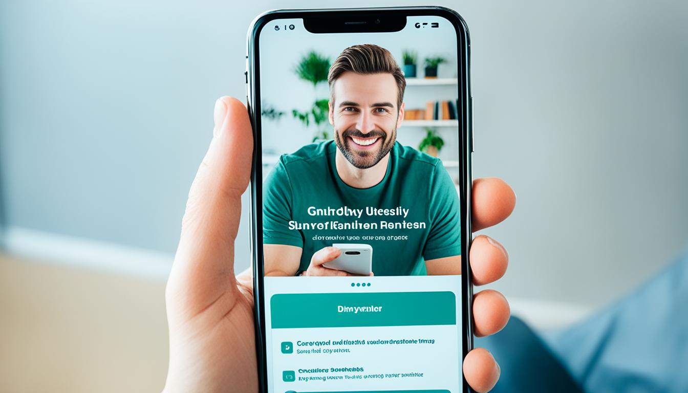
Introducing Torsion Mobile Software
In this section, let’s take a closer look at Torsion Mobile Software and its impressive array of features. Designed to optimize websites for mobile devices, this innovative software leverages responsive design principles to deliver an enhanced user experience.
One of the standout features of Torsion Mobile Software is its ability to adapt websites to fit different screen sizes and resolutions. Whether users are accessing your website on a smartphone with a small screen or a larger tablet, Torsion Mobile ensures that the content remains easily accessible and navigable.
By leveraging cutting-edge technology, Torsion Mobile Software eliminates the frustration that comes with poorly optimized websites on smartphones. Users can seamlessly navigate through your site, interact with various elements, and consume content without any hiccups.

With Torsion Mobile Software, you can bid farewell to the outdated pinch-to-zoom method. Say hello to a user-friendly experience where all elements and buttons are intelligently resized and rearranged to ensure effortless interaction.
Not only does Torsion Mobile Software optimize the visual aspect of your website, but it also enhances its performance. The software optimizes load times, reducing bounce rates and improving user engagement. With faster loading speeds, users enjoy a seamless browsing experience, keeping them hooked to your website.
Effortlessly optimize your website for mobile devices with Torsion Mobile Software. From responsive design principles to improved performance, this software ensures that your website delivers a top-notch user experience on smartphones.
In the next section, we will explore the importance of mobile web browsing in today’s digital landscape and how Torsion Mobile Software helps businesses gain a competitive edge.
The Importance of Mobile Web Browsing
In today’s digital landscape, mobile web browsing plays a pivotal role in the success of businesses. With the increasing dominance of mobile traffic, it has become essential for companies to optimize their websites for smartphones. This section explores the importance of mobile web browsing, the changing consumer behavior patterns, and the competitive advantages businesses can gain by adopting a mobile-first approach.
1. Dominance of Mobile Traffic
The shift to mobile devices has revolutionized the way people access the internet. According to statistics, mobile devices account for more than half of global web traffic. This trend is expected to grow further, making mobile traffic a significant factor that businesses cannot afford to overlook.
2. Changing Consumer Behavior Patterns
The rise of smartphones has resulted in a fundamental change in consumer behavior. Today, people rely heavily on their mobile devices to search for information, make purchases, and interact with brands. A seamless mobile web browsing experience has become an expectation, and companies that fail to meet these expectations risk losing potential customers to competitors who provide a better mobile experience.
3. Competitive Advantage through Mobile-First Approach
Adopting a mobile-first approach allows businesses to stay ahead in today’s mobile-centric world. By optimizing their websites for smartphones, companies can reach and engage with a larger audience. Providing a user-friendly mobile experience enhances brand perception, increases customer satisfaction, and encourages repeat visits and conversions.
“In a world where mobile devices dominate web traffic, businesses must prioritize mobile web browsing to remain competitive and relevant.” – Marketing expert John Smith
With the importance of mobile web browsing evident, companies need to invest in responsive design and mobile optimization strategies. By ensuring their websites adapt to different screen sizes and resolutions, businesses can deliver a seamless and immersive user experience on smartphones. This proactive approach ultimately leads to higher engagement, increased conversions, and a stronger online presence.
| Benefits of Mobile Web Browsing: |
|---|
| 1. Increased reach and accessibility to a larger audience |
| 2. Enhanced customer satisfaction and brand loyalty |
| 3. Improves search engine rankings and visibility |
| 4. Higher mobile conversion rates and revenue growth |
Torsion Mobile Software: The Future of Mobile Web Browsing
In today’s fast-paced digital landscape, mobile web browsing has become increasingly important. With a growing number of consumers relying on smartphones for their online activities, businesses need to adapt and provide a seamless mobile experience. That’s where Torsion Mobile Software comes in.
Designed to optimize websites for mobile devices, Torsion Mobile Software takes website usability to new heights. Its advanced features enhance performance, ensuring faster loading times and smoother navigation on smartphones. With responsive design principles at its core, Torsion Mobile Software guarantees that your website adapts seamlessly to different screen sizes and resolutions.
But the benefits of Torsion Mobile Software don’t end there. It offers cross-platform compatibility, meaning your website will remain accessible and fully functional across evolving smartphone technologies. Whether your audience is using iOS, Android, or any other operating system, Torsion Mobile Software has got you covered.
By choosing Torsion Mobile Software, you’re investing in a future-proof solution. As technology continues to evolve, you won’t have to worry about your website becoming outdated or incompatible with new devices. Stay ahead of the curve and ensure your website remains user-friendly and engaging, no matter how the mobile landscape changes.