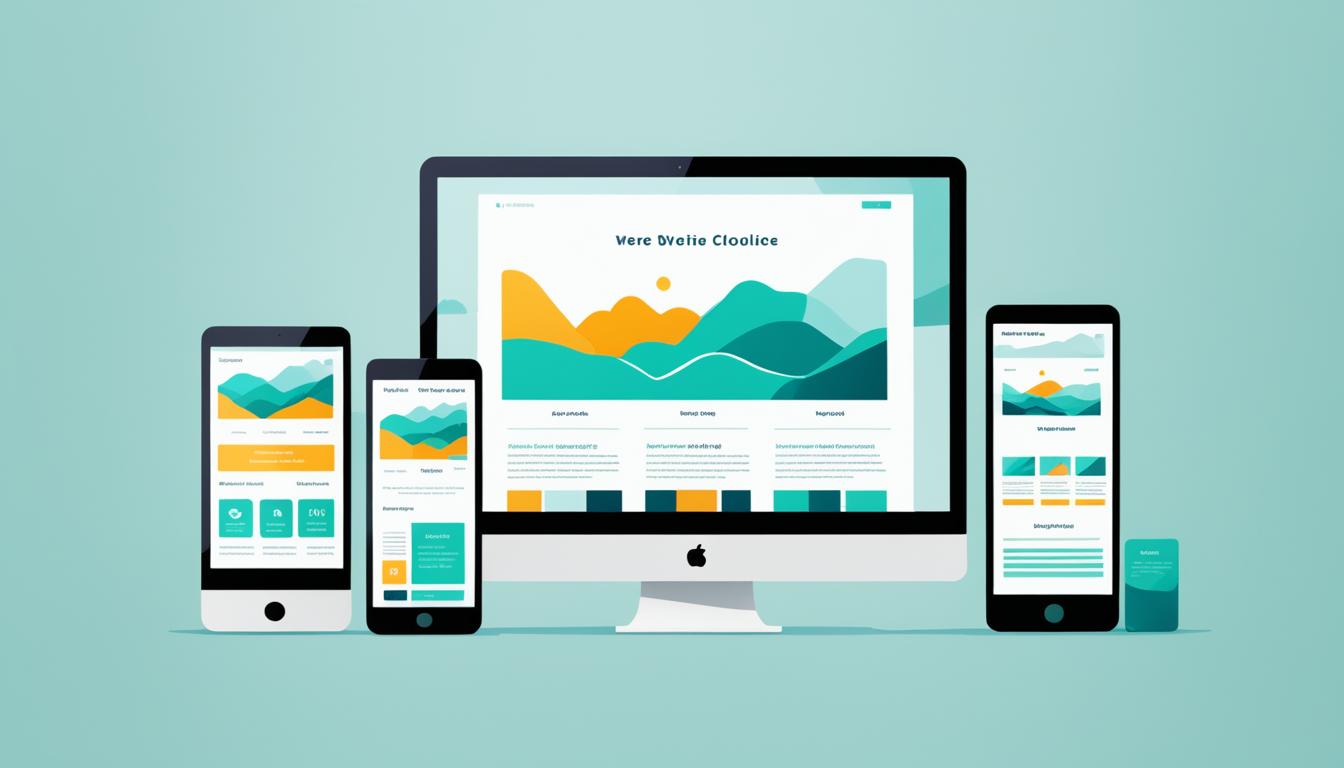
In today’s digital age, having a website that looks great on any device is essential. Whether your audience is browsing on a desktop, smartphone, or tablet, you want to ensure that they have a seamless user experience and can access your content easily. This is where responsive web design comes in.
Responsive web design is an approach that focuses on creating websites that adapt and adjust to different screen sizes and orientations. With responsive design, your website will automatically adjust its layout, fonts, and images to provide the best possible viewing experience across various devices.
By implementing responsive web design, you not only make your website visually appealing, but you also enhance user experience and accessibility. Users can navigate and interact with your website effortlessly, regardless of the device they are using.
Whether it’s a large desktop monitor, a smartphone held vertically, or a tablet in landscape mode, your website will look great and function seamlessly. This not only keeps your visitors engaged but also helps to lower bounce rates and increase conversions.
In the next sections, we will explore the benefits of responsive web design, delve into the key elements that make up a responsive website, and discuss the best practices for implementing responsive design. So, let’s dive in and discover how responsive web design can take your website to the next level.
The Benefits of Responsive Web Design
Responsive web design offers several valuable benefits that enhance user experience and ensure your website’s accessibility across various devices. By adopting a responsive design approach, your website can adapt seamlessly to different screen sizes and orientations, resulting in higher user engagement and reduced bounce rates.
One of the key advantages of responsive web design is its ability to improve user experience. With a responsive website, visitors can easily navigate and interact with your content on any device, including mobile phones, tablets, and desktop computers. This adaptability eliminates the need for users to constantly zoom or scroll horizontally, providing a more enjoyable browsing experience.
A responsive design also contributes to better search engine optimization (SEO) and improved visibility. With a single website that caters to all devices, you can avoid issues related to duplicate content and maintain consistent branding across platforms. This consistency leads to higher search engine rankings, increased organic traffic, and ultimately, more conversions.
Another significant benefit of responsive web design is the cost-effectiveness it offers. Developing and maintaining a single responsive website is more efficient compared to managing separate versions for desktop and mobile devices. This streamlined approach saves time, reduces development costs, and simplifies website management in the long run.
Furthermore, responsive design ensures that your website remains future-proof. As new devices with varying screen sizes continue to emerge, a responsive website can effortlessly adapt to accommodate these changes. By prioritizing a flexible and adaptable design, you can stay ahead of the curve and provide an optimal user experience to your audience.
| Benefits of Responsive Web Design |
|---|
| Improved user experience on all devices |
| Enhanced search engine optimization (SEO) |
| Cost-effectiveness in development and maintenance |
| Future-proof design adaptability |
As digital technology continues to evolve, responsive web design has become an essential aspect of modern web development. Its ability to provide an optimal browsing experience across devices, boost SEO efforts, and streamline development processes make it a valuable investment for businesses of all sizes.
Key Elements of Responsive Web Design
Responsive web design relies on several key elements to ensure optimal functionality across different devices. Let’s explore these elements in detail:
Flexible Grids and Layouts
A flexible grid system is a fundamental component of responsive web design. By using a grid-based layout, designers can create a responsive structure that automatically adjusts to fit various screen sizes. This ensures that all elements on the website are properly aligned and visually appealing, regardless of the device being used.
Media Queries
Media queries play a crucial role in responsive design by allowing the website to adapt and respond based on the user’s device. By using CSS media queries, designers can set specific rules and styles for different screen sizes, resolutions, and orientations. This enables the website to provide an optimal viewing experience on mobile devices, tablets, and desktops alike.
Responsive Images
Responsive images are an essential element of responsive web design. Using the tag with appropriate attributes, designers can ensure that images scale proportionally and adjust based on the available screen space. This prevents images from appearing too large or too small, maintaining a visually appealing experience.
Scalable Fonts
Scalable fonts, also known as fluid typography, play a vital role in responsive design. By using relative font sizes such as percentages or viewport units, designers can ensure that the text adjusts proportionally to various screen sizes. This allows the content to remain readable and accessible regardless of the device used by the user.
“Responsive web design relies on flexible grids, media queries, responsive images, and scalable fonts to create a seamless and visually appealing experience across different screen sizes.”
By understanding and implementing these key elements of responsive web design, you can create a website that adapts to different devices and provides an optimal user experience. Now that we have explored the main components, let’s move on to the best practices for implementing responsive design.

| Key Elements | Description |
|---|---|
| Flexible Grids and Layouts | Provides a responsive structure that adjusts to different screen sizes |
| Media Queries | Allows the website to adapt and respond based on the user’s device |
| Responsive Images | Ensures images scale and adjust based on the available screen space |
| Scalable Fonts | Allows text to adjust proportionally to different screen sizes |
Best Practices for Implementing Responsive Web Design
When it comes to implementing responsive web design, following best practices is crucial to ensure your website looks great and functions seamlessly across all devices. Here are some key recommendations to help you achieve optimal results:
1. Embrace Mobile-First Design: Start by designing your website for mobile devices first, then scale up for larger screens. This approach ensures a smooth, user-friendly experience on smartphones and sets a solid foundation for responsiveness.
2. Optimize Loading Speed: Speed is essential for user satisfaction and search engine rankings. To improve loading speed, reduce the file sizes of images and other media, minify your HTML, CSS, and JavaScript, and leverage caching techniques to deliver content more efficiently.
3. Conduct Thorough Testing: Test your website on a wide range of devices, browsers, and screen sizes to ensure it looks and performs as intended. Consider using emulators, simulators, or responsive design testing tools to simulate different devices and check for any usability issues.
4. Regularly Update and Maintain: Keep your website responsive and user-friendly by regularly updating its content, design, and functionality. This includes staying up-to-date with the latest web standards, security updates, and design trends to provide the best experience for your visitors.